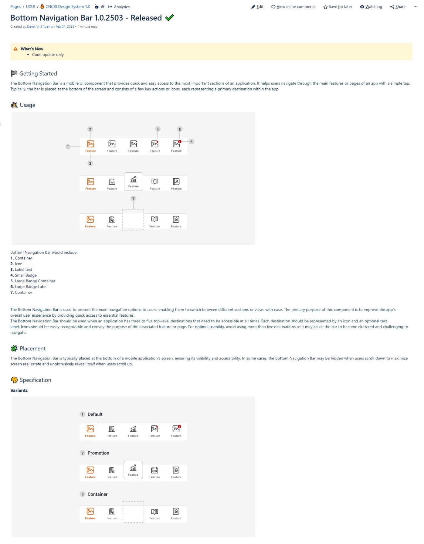
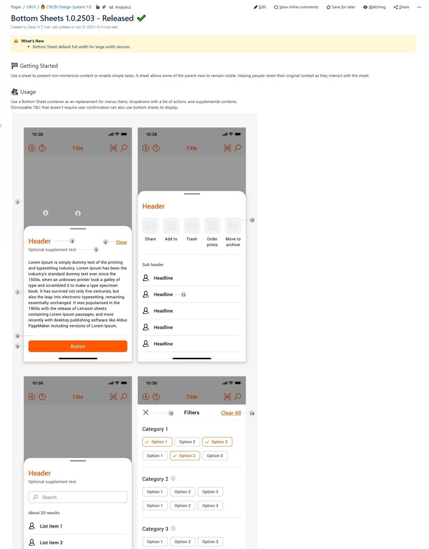
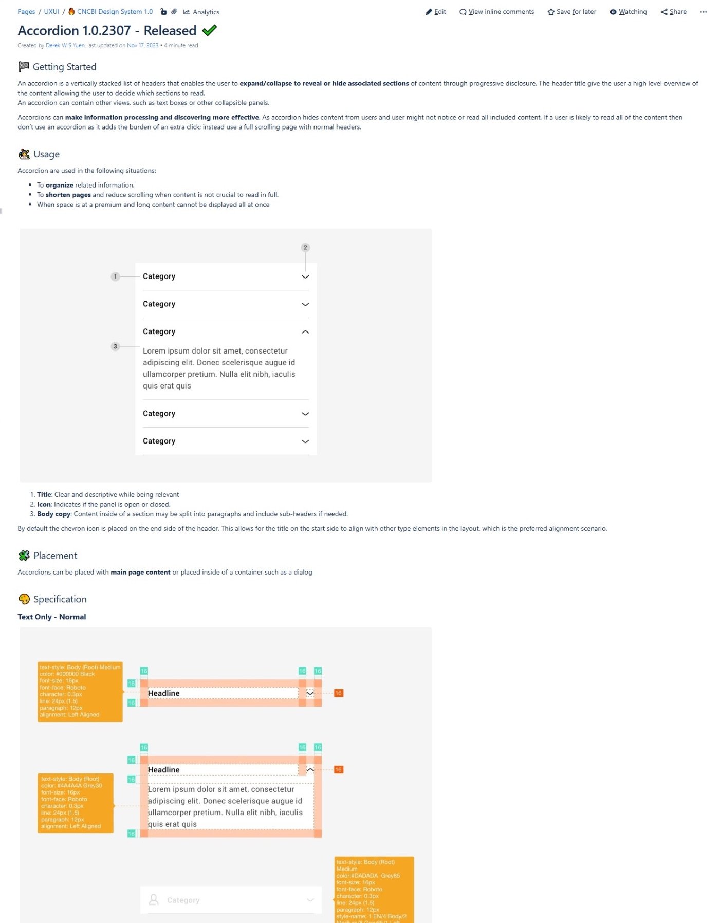
CNCBI inMotion Design System
As the 'inMotion' banking app grew, it became a patchwork of inconsistent interfaces and redundant code, slowing down development and creating a fragmented user experience. This project involved creating a comprehensive design system from the ground up to establish a single source of truth, unifying the product's design language and accelerating the entire development lifecycle.
Objective
To unify the user experience and accelerate product development by creating a scalable, single-source-of-truth design system.
Background
When I joined the team, the "inMotion" mobile banking app was suffering from rapid, unstructured growth. My manager observed that numerous design styles and languages had been deployed across different product silos. This resulted in a busy, crowded interface that lacked standardization. We saw significant inconsistencies in UI and user flows, with issues as fundamental as font size misalignment across pages and devices.
Some teams opted for single-page disclosure styles, while others crammed as many fields as possible onto one screen. This visual fragmentation meant the underlying code was just as inconsistent. Work was rarely cross-referenced, as business units prioritized meeting their specific function's requirements over a unified brand experience. A single source of truth was urgently needed to minimize deviation and improve efficiency.
My Role & Sponsorship
As a lead designer within the dedicated UXUI Squad, I was tasked, alongside another designer, with the end-to-end creation of this design system. The project was sponsored by the platform owner of "inMotion" and received strong support from executive management, including our Group Head, who understood the critical link between a unified app experience and user trust. My role involved everything from the initial audit and strategy to component design, documentation, and driving adoption across the organization. Our squad was a cross-functional team including developers, test engineers, a business analyst, and a product owner, all contributing to the system's success.
The Challenge
The core challenge was to rein in the existing chaos and build a system that could serve multiple product teams while creating a single, cohesive user experience. The strategic goals were clear:
Drastically Increase Efficiency
By creating a library of pre-built, reusable components, designers could simply copy and paste elements, while developers could pull from a trusted codebase, slashing delivery times.
Ensure UI and Brand Consistency
Establish a single source of truth that would eliminate guesswork and ensure every part of the app felt like it belonged to the same family.
Enable Rapid, Scalable Updates
Build a system where a single change—like fixing a bug or enhancing a component's style—would propagate across every function that used it, dramatically reducing maintenance overhead.

Different design language implemented due to a lack of design system
Phase 1: Audit, Strategy, and Foundation
Before building, we had to understand the landscape and define our principles.
Research and Inspiration
We aimed to align with the latest design trends while respecting our brand. We chose modern, highly readable sans-serif fonts like Roboto and Noto Sans. Critically, we referenced industry-leading systems like Ant Design, Google's Material Design, and Apple's Human Interface Guidelines not to copy them, but to use them as a "checklist" to ensure our system was robust and covered all necessary use cases.Color & Typography Strategy
As a banking app for a middle-aged demographic, we balanced a modern aesthetic with trust. Our brand's energetic orange was used sparingly but strategically as a primary accent to build strong brand recall without overwhelming the user. All color and font choices were checked against contrast standards for readability.Defining Design Tokens
To ensure scalability and a seamless handoff to developers, we established a rigorous naming convention for our design tokens, following aCategory/Component/Variant/Size/States/Optionformat.
Phase 2: Atomic Design & Collaborative Build
We adopted an atomic design methodology to build our library with logic and scalability.
Building the Library
We started with atoms (our color set, icons), combined them into molecules (a search form with an input field and button), and composed those into organisms (the complete app header).Tooling and Structure
Our design toolkit was meticulously organized in Sketch, with three separate files: one for foundations (colors, fonts), one for icons, and a main library for components and templates. This kept the system clean and easy for designers to navigate.Bridging Design and Development
This was a true collaboration. Designers used Confluence for detailed documentation (specs, behaviors, do's and don'ts), while developers used Storybook to showcase live components. This created parallel sources of truth tailored to each team's needs.
Phase 3: Governance, Feedback, and Adoption
A design system is a living product, and we treated it as such.
Feedback Loop
We established a weekly designer sharing session. This became our primary forum for gathering feedback, asking questions, and identifying where the design system was falling short or could be improved.Governance Model
To manage change, we implemented a formal process using Jira. Designers and developers can raise tickets to request new components or enhancements. The UXUI squad regularly reviews these tickets, and some are presented in our design meetings for wider team input.Driving Adoption
We actively "sold" the system to stakeholders by promoting its core benefits: reduced development time, streamlined design effort, and a vastly improved, consistent user experience through repeatable patterns.
The Solution & Impact
The deployment of the design system was a core part of our "UXUI Standardization" projects, and the impact was significant and measurable.
Massive NPS Improvement: Since the official deployment in July 2023, the Net Promoter Score (NPS) for the 'inMotion' app rose from 32 to 52 by May 2025—a 62.5% increase in under two years.
Improved User Sentiment: We saw a corresponding and noticeable reduction in negative user feedback related to inconsistency and usability.
Achieved Efficiency Goals: The system is now the backbone of our product development, enabling teams to build higher-quality features faster.
Project Learnings
A Design System is a Product for Internal Users
Treating our designers and developers as the "users" of the system was crucial. This meant creating great documentation, actively seeking their feedback, and having a clear roadmap.Pragmatism Delivers Value Faster
The debate between designing for every edge case versus shipping a functional system taught us a valuable lesson. We learned to launch with what was essential and iterate based on real-world requests from our teams.A Design System is Never 'Done' and be agile
Our work has laid a powerful foundation. The long-term vision is to expand this system to be fully compatible with our upcoming SME Mobile application and our Online Banking platform, ensuring all our customers benefit from the same high-quality, systematic design patterns.